



In this article
Reels cover and thumbnail design for a consistent profile grid comes down to two habits: follow five Cover Design Rules on every cover (one focal point, at most 3 to 5 words, brand type and palette, high contrast, key text centered), and lock each series into one repeatable grid system. Then shrink the cover to phone-tile size before you post and check that the title still reads after a center-heavy crop. Rules make each cover legible, systems make the grid look intentional, and the small-size check catches the failures you can't see at full screen.
It works for any brand in any design tool, and it gets faster once your first cover template exists. Below are the five rules, four reusable grid systems, how to choose between a video frame and a designed still, and a seven-step checklist for your next three Reels.
For pixel sizes and Meta's official cover recommendation, see the Reel cover size and specs guide, which lists every figure with its source.
What a Reels cover does (and how it differs from the first frame)
A Reels cover is the still image people see before they press play: on your profile grid, in the Reels tab on your profile, and often as the preview when someone shares the Reel. Its job is recognition. A visitor scanning your profile should be able to tell what each Reel is about, and that all of them come from the same brand, in about a second.
The first frame is a different job. It is what plays the moment your Reel appears in someone's feed, usually with the sound off, and it has to stop the scroll and carry the hook. That needs motion, a mute-first caption, and a reason to keep watching. We cover that separately in our guide to the first frame for in-feed viewing.
Keeping the two apart saves a lot of grief:
- The cover is read on a small tile, next to other covers. It competes with your own grid, so consistency matters more than surprise.
- The first frame is read full screen, in motion, among other brands' content. It competes with the feed, so the hook matters more than the grid.
- They are often cropped differently. A cover that looks perfect full screen can lose its top and bottom on the grid.
One more practical point: Instagram Help currently says you can't edit the cover after you've uploaded the Reel. Some guides say otherwise, but plan as if Help is right and choose the cover at share time. That is exactly why a pre-upload check (later in this post) is worth the two minutes.
Cover Design Rules: five rules for every cover
Instagram Reels cover design for brands is less about one perfect cover and more about the same few decisions made every time. These five rules apply to every cover, whatever grid system you pick. If a cover breaks one, it will usually look off on the grid, even if nobody can say why.
1. One focal point
Pick one thing the eye lands on: a face, a product, or a short title. Not all three at the same size. When a cover has a product, a person, a logo, and a headline fighting for attention, it turns into visual noise at tile size. If you need a second element, make it clearly smaller and quieter than the first.
2. At most 3 to 5 words
A cover title is a label, not a caption. "Spring restock" or "3 ways to style it" reads on a tile. A full sentence does not. If you can't say what the Reel is in five words, the cover is the wrong place to explain it. Put the detail in the Reel and the post copy.
3. Brand type and palette, every time
Use the same one or two typefaces and the same two or three colors on every cover. Don't pull a new trending font for each post. The easiest source is your own site: your headline font, your button color, your usual background. If you haven't written those down yet, here is how to pull your brand palette and type from your website into a one-page sheet the whole team can use.
4. High contrast at thumbnail size
Dark text on a light background, or light text on a dark one. Thin type over a busy photo disappears on a tile. If the image fights the text, add a solid band or a soft shadow behind the title rather than another sticker. A quick test: turn the cover grayscale. If the title still pops, the contrast is strong enough.
5. Keep key text centered
Meta does not publish a profile grid crop ratio for Reel covers. You will see 3:4, 4:5, and 1:1 quoted as if they were official, but none of them come from Meta. The practical guidance is simple: keep the title, the face, and the product in the middle of the frame, so they survive whatever crop the grid applies. Leave the top and bottom for background, not meaning.
Four grid systems for a consistent Reels grid
Rules make one cover readable. A grid system makes twenty covers look like they belong together. Pick one system per content series (for example, tips, product drops, or customer stories) and stick with it for that series. You can run two systems side by side if each series keeps its own. Think of these as Reels thumbnail ideas for a consistent grid that you set up once and reuse.
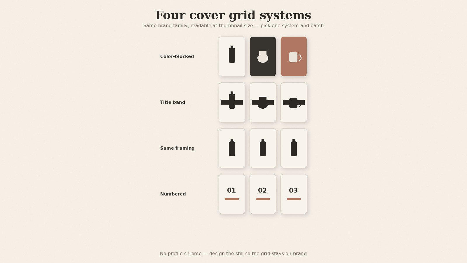
| Grid system | What repeats | Best for | Watch out for |
|---|---|---|---|
| Color-blocked series | One background color per series or pillar | Brands with 2 to 4 clear content pillars | Colors drifting away from the brand palette |
| Recurring title band | A solid band in the same spot and style | Educational series, tips, how-tos | A band so large it hides the image |
| Consistent face or product framing | Same crop, distance, and angle on the subject | Founder-led, creator-led, or hero-product brands | Different lighting from shoot to shoot |
| Numbered series | A large number plus a short title | Multi-part series people want to collect | Starting a series you won't finish |
Color-blocked series
Give each content pillar its own background color from your palette. Tips might always sit on cream, product drops on your accent color, behind-the-scenes on charcoal. Over a few weeks, the grid starts to read as a pattern, and visitors learn what each color means without reading a word. Keep the type and layout identical across colors so the blocks feel like one family.
Recurring title band
Place a solid band, in the same position and style, on every cover in the series, with the title inside it. The image behind can change freely (a product shot, a team photo, a frame from the video) because the band ties it together. Keep the band in the center area so the grid crop doesn't slice it, and keep it slim enough that the image still does some work.
Consistent face or product framing
If a person or a hero product is the star of your Reels, frame them the same way every time: same distance, same eye line, same side of the frame, similar light. No title is needed when the framing is consistent, though a short one helps. This system suits founder-led brands and single-product shops, and it pairs well with pulling a frame straight from the video.
Numbered series
Put a large number on each cover ("01", "02", "03") with a short title underneath. Numbers tell visitors there is a set, which gives them a reason to go back and watch the rest. Only start a numbered series if you know you will publish at least the first few parts, because a grid that stops at "02" looks abandoned.
Frame from the video vs a designed still
You have two ways to make a cover: pull a frame from the Reel itself, or design a separate still (in the app, you can usually choose a frame or add an image from your camera roll). Neither is better in general. The right pick depends on your grid system and on whether a strong frame exists.
Pull a frame when:
- The Reel has a clean, sharp moment with your subject in the center.
- You use consistent face or product framing, so the frame already matches the grid.
- You want the cover to feel close to the video itself.
Design a still when:
- Every frame has motion blur, a mid-blink face, or a busy background.
- Your system needs a title band, a color block, or a number.
- You want to batch covers ahead of time, separately from the edit.
A hybrid works well for many brands: pick the best frame from the video, export it as a still, then add your title band or number on top in brand type. You get the realism of the footage with the consistency of a template. Whichever route you take, judge the result with the check below, not at full screen.
The pre-upload small-size check
Run this before every share. It takes a couple of minutes and catches the common grid failures, and since Help says the cover can't be edited after upload, this is your last real chance.
- View it at phone-tile size. Zoom out on your screen until the cover is roughly the width of a thumbnail on a phone profile, or hold your phone at arm's length. Can you read the title? Can you tell what the subject is?
- Do the center-crop test. Cover the top and bottom of the image with your hands, or mask them in your design tool. Does the title survive? Does the face or product survive? If either gets cut, move it toward the center.
- Check grayscale contrast. Desaturate the cover. If the title sinks into the background, add a band, darken the photo, or switch text color.
- Place it next to your last covers. Drop it into a simple three-column mock grid beside your most recent covers. Does it look like part of the same family? If it's the only one with a different font or color, fix it now.
- Read the words once more. Five words or fewer, no typos, no hashtags on the cover.
If a cover fails any step, fix it before you post. A small fix now is easier than a grid that looks off for months.
DIY checklist: design your next Reels covers by hand
This is how to design Reels covers that stay on-brand, step by step. You can do all of it with any design tool and your phone. No special software required.
- Decide the cover's job. It is for grid recognition, not the mute hook. The hook belongs in the first frame.
- Pick one grid system for this series. Color-blocked, title band, consistent framing, or numbered.
- Apply the five design rules. One focal point, at most 3 to 5 words, brand type and palette, high contrast, key text centered.
- Choose frame pull or designed still. Pull a frame if a clean one exists. Design a still if the system needs a band, block, or number.
- View the cover at phone-tile size. Confirm the title survives a center-heavy crop.
- Link-check sizes if you need pixels. Use the specs guide linked above, and don't invent an official grid ratio.
- Batch the next 3 covers in the same system before you post, so the grid stays consistent while the template is fresh.
Need more Reels to put on that grid? Start with Instagram Reels ideas for brands (blank calendar).
Your grid is read at tile size, so a cover that only works full screen isn't finished yet.
Make on-brand Reels faster with beREEL
The checklist above works by hand. Where teams usually lose time is earlier: making enough on-brand Reels that a consistent grid is even possible.
beREEL starts from your website. Paste it in and it builds Brand DNA (audience, offer type, personas, benefits, tone), then filters a TikTok-style feed of 600+ templates to your buyers. You remix a proven format onto your product or service, make photo and video Reels from the stills and clips you already have, and keep captions in the safe area in your brand type. When a Reel has a strong, centered still, you can use it as the cover and finish it with your grid system.
Creating a free account takes about a minute, and you start with 170 free credits, no card needed: www.bereel.pro.
A grid that looks like one brand
Pick one system, apply the five rules, and check every cover at tile size before you share. That is enough to turn a messy Reels grid into one that looks planned. Start with your next three Reels, not your whole archive, and let the system prove itself on the grid.