


In this article
Instagram Reels work for SaaS brands with no physical product when you map each marketing job (prove, teach, trust, unblock) to one camera-ready format: screen demo, UI crop, founder POV, customer proof clip, or objection answer. Your product lives in a browser tab. Film the UI and the people who sell the workflow, then end every Reel with a clear next step (trial, demo, or profile visit).
If you have no jar, no unboxing, and no lifestyle shoot, you do not need a product table to show up on Reels. You need a No-SKU Format Map: one list that tells you each week which part of the software to film.
Service teams film the job itself. SaaS teams film the product in use. If you sell a service rather than software, use Instagram Reels for service businesses without a product shoot. Need themes for a blank calendar instead? Use Instagram Reels ideas for brands when the calendar is blank.
Why "no SKU" stalls SaaS Reels (and why that is an advantage)
SaaS teams stall on Reels for a systems reason: product brands open a photo library; you open a browser and a backlog of demos. Without a mapping, every post becomes a creative brief from scratch. Teams either overproduce feature tours that feel like ads or disappear for weeks.
The advantage is proof. Buyers of B2B and self-serve software decide on whether the product does the job. A Reel that shows one workflow outcome or answers a real objection often converts better than a polished brand spot with no UI. Absence still costs more than a mediocre Reel. The fix is not a studio day. It is filming the product you already ship.
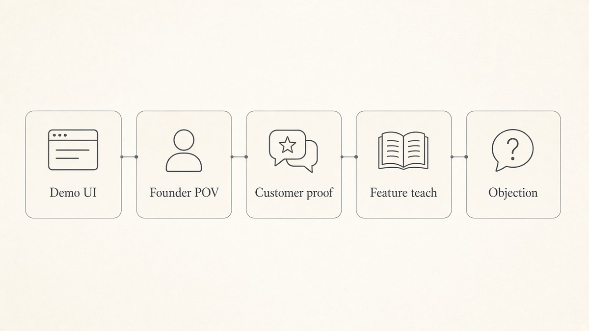
The No-SKU Format Map: five formats from real software
Name five formats so "what do we film?" has a short menu. Every Reel you ship should start from one job, then one format, not a random tip list.
| Job | Format | What the camera captures | Best when |
|---|---|---|---|
| Prove | Screen demo / magic-moment | One action in the product, then one visible result | Feature adoption, "does it actually work?" |
| Teach | UI workflow vignette | Zoomed panel of a short workflow (not a full dashboard tour) | Onboarding, power-user tips, changelog moments |
| Trust | Founder POV | Face + one problem you solved building or selling the product | Category education, spicy take, build-in-public |
| Trust | Customer proof clip | Quote cold-open, permissioned Loom cut, or anonymized outcome card | Pipeline, retention, "who is this for?" |
| Unblock | Objection / myth answer | One buyer doubt + one plain answer (face or UI B-roll) | Pricing fear, "we're too small," setup time myths |
This is not a content-pillar brainstorm. It is a filming menu. Pillars (education, personality, social proof) still matter for planning themes; they do not tell a product marketer what to point the phone or screen recorder at today. The map does.
Map one offer you sell (worked pattern)
Write one line: Offer or feature | job | format | capture source.
- Usage analytics dashboard | prove | screen demo | 30s product recording of "filter, then chart updates"
- Shared inbox | teach | UI workflow vignette | zoomed reply-assign-done sequence
- Founder-led sales | trust | founder POV | desk take answering "why we built X"
- Customer success win | trust | customer proof | permissioned quote over anonymized UI
- "Too complex to set up" objection | unblock | objection answer | face + 15s setup UI
Once the line exists, the week stops starting from zero.
Make product UI readable (and trustworthy) in 9:16
Dropping a full desktop dashboard into a vertical Reel fails the mute test. Viewers see chrome, not a result.
One panel, one action, one result. Crop or zoom so a single control and its outcome fill the middle band of the phone. Safe zone: keep critical UI and captions out of the top and bottom UI chrome of Instagram.
Hook on the outcome or problem, not the logo. Open on the pain or the before state. The product mark appears after the proof lands.
Mute-check on a real phone. If the UI text is unreadable without sound, add on-screen words for the step and the result. Captions belong in the safe area with readable type.
Avoid the feature-tour ad. A tour of every menu reads as a commercial. One workflow vignette reads as help. If you need depth, ship a series of single-job Reels, not one overloaded cut.
Who should be on camera (and when screen-only is enough)
Screen-only when the UI itself is the proof (demo, workflow vignette, changelog). Add a short voiceover or on-screen text for the job.
Founder or teammate when trust or category opinion is the job. Unscripted problem demo beats a logo bumper: state the buyer friction in second one, show the fix, stop.
Customer (with permission) for proof. Prefer a quote cold-open or a short Loom cut over a polished testimonial set. Anonymize when you cannot name them: role, company stage, one metric card.
Talking head is required when the face *is* the trust signal. It is optional when the UI already answers the job. Do not force a face onto every Reel to look "more human"; force a clear job onto every Reel.
Turn assets you already have into Reels
You already film the product: demos, webinars, support Looms, changelog clips, sales call snippets (permissioned). Treat those as a clip harvest, not a reason to start from a blank editor timeline every week.
- Pull one recording that shows a single outcome.
- Cut 15 to 45 seconds around the action-to-result beat only.
- Add a problem-first hook and mute-safe captions.
- Map the cut to one row on the No-SKU Format Map so the next person can reuse the pattern.
Inspiration-first remix of a proven format onto your workflow beats staring at an empty timeline. When the comparison of blank-editor start vs filtered inspiration is the question, use the CapCut-vs-inspiration post on this blog; here the rule is simple: start from a job and a format, then edit.
If voice, palette, offer, and buyer are still scattered across decks, lock brand DNA from your website once so UI captions and founder scripts stay consistent. When you want this mapping inside a weekly cadence rather than ad hoc posts, use the weekly Reels workflow for brand teams.
What a SaaS Reel should ask for (and what to measure)
End with one next step that matches the offer:
- Start a trial (name the plan or the first action)
- Book a demo / fit call
- Visit profile for the specific landing page
- Reply with the objection you just answered
Say the step on screen and in the caption. Soft brand cues beat a hard sell every frame: clear offer, clear buyer, clear action.
Measure what predicts pipeline or product interest, not vanity alone:
- Saves on teach and prove cuts
- Profile visits and link taps (UTM trial starts when you have them)
- Reply questions that name the feature or objection
- Early hold (did the first second earn the second?)
Views from the wrong audience are noise. A 20-second UI demo that drives trial clicks beat a viral founder take that drives zero product interest.
Your product already has a shoot library. It is called your UI. The camera only needs a map.
DIY checklist: No-SKU Format Map without a product shoot
Do this with a phone or screen recorder, a notes app, and one real feature you ship. No physical SKU required.
- Name the one job for the next Reel: prove a feature, teach a workflow, build trust, or unblock an objection.
- Pick one format from the No-SKU Format Map (screen demo, UI crop, founder POV, customer proof, objection answer).
- Capture 15 to 45 seconds of real product UI or founder face. No fake stock office. No full-dashboard dump.
- Hook on the outcome or problem, not the logo. Put the tip or result on screen for mute viewers.
- Mute-check captions and UI readability on a phone. Fix crop and type before you ship.
- Ship. Judge saves, trial clicks, demo requests, or reply questions, not vanity likes alone.
- Log the map line (offer | job | format | capture source) so next week reuses it instead of reinventing.
Example: a B2B inbox tool maps "assign and close" | prove | screen demo | 25s zoomed UI of assign then status change, hook "Your shared inbox is not a todo list," CTA "Start free trial." No unboxing. No lifestyle shoot.
Ship SaaS Reels faster with beREEL
The checklist works by hand. What slows SaaS teams is turning demo cuts and founder takes into on-brand Reels every week, then finding formats that fit the buyer instead of scrolling random trends.
beREEL handles the format side, inspiration-first. Paste your website to build Brand DNA (audience, offer type, personas, benefits, tone). It filters a TikTok-style feed of 600+ templates to that audience so you remix proven formats onto your product and workflows, not onto a blank timeline. Make photo and video Reels from stills and clips (UI screenshots, demo cuts), keep captions in the safe area with your brand type, and adjust pace, crop, and cut in the editor. Creating a free account takes about a minute, and you start with 170 free credits, no card needed: www.bereel.pro.
Keep filming from real UI and real founder proof, and keep the No-SKU Format Map as your source of truth. beREEL just means you never start the week from an empty feed.